Menu Component
Description
The Menu in Assemble Web is split into separate Components. We also have business logic in place for the Data Fetch and parsing of that data into things that the Component understands.
UI Cases
Component Library Default state

Component Library with Dropdown
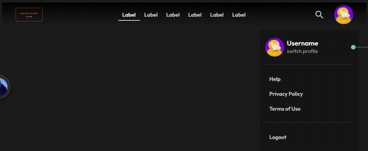
Component Library on Mobile
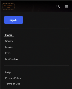
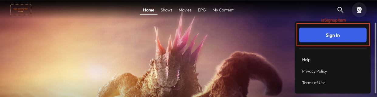
Assemble Web Default state
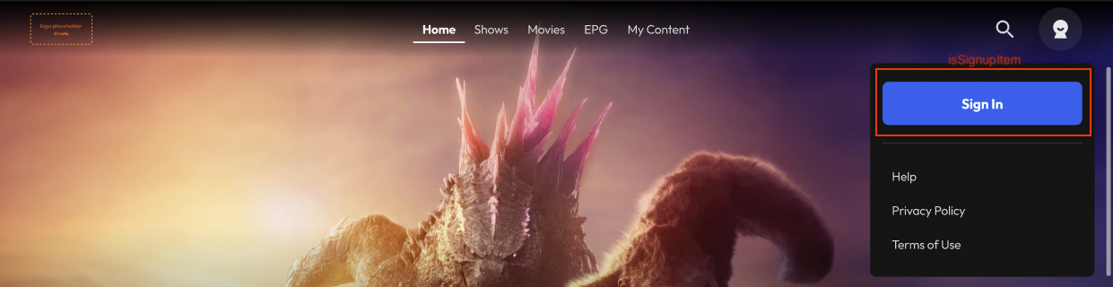
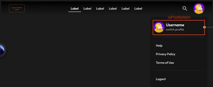
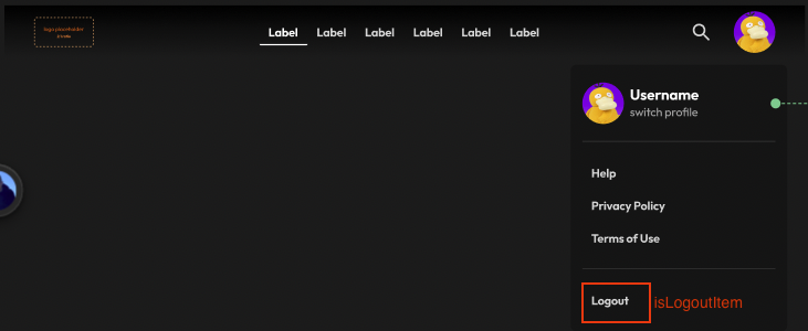
Assemble Web Logged in state

DataModel
We have separate DataModels, but basically you can check the Assemble Web CMS Menu and MenuItem Data Model in Confluence
For the Component itself. please review Menu Data types
CMS and UI Map
-
Logo: The logo uses the CMS Config
appLogo -
Primary Items: items identify as
primaryon theitemGroup. Any nonsecondaryitems will also by defaulted to this type with a few exceptions:-
items that includes the flag
isSignupItem,isSearchItem,isLogoutItemorisProfileItemWhich will be included in their own section/group based on the image. -
Within these flags, as it allows multiple active flags at the same time, a priority order has been defined like:
- (1) isSignupItem
- (2) isProfileItem
- (3) isSearchItem
- (4) isLogoutItem
-
-
Secondary Items: items identify as
primaryon theitemGroup